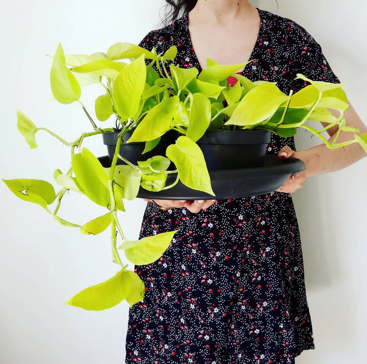

Today’s post is about plant styling my newest acquisition – the luminous neon pothos.
A few months ago I’d got hold of a philodendron brasil and some of the beautiful foliage was almost entirely neon coloured. It’s still one of my favourites and just knew that a neon would also be well loved in my collection.
Inspiration for putting this post together came after sharing a photo of my purchase on Instagram and getting into some conversations with people feeling intimidated by its colour. After lusting after this plant for a while, I admit that it wasn’t until I got it home and compared it to the other foliage I started to understand what people were talking about – it is pretty bright (hence its name!)
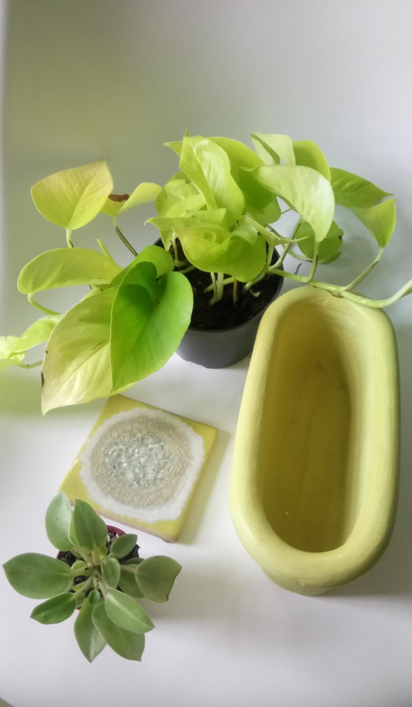
Below are some photos of the plant in question… I can always tell when a plant quickly becomes one of my favourites when I can’t stop photographing it (…the same happened to my philodendron brasil!)


WHAT TYPE OF NEON DO YOU HAVE?
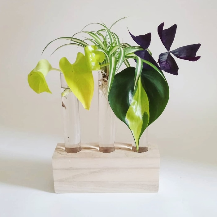
Before we get into the plant styling, I just wanted to point out that there are two similar plants that often get confused – neon pothos (epipremnum aureum) and philodendron neon. I created this image below to clarify. As is often the case, there are sometimes pieces of both plant in one pot! Thanks for letting me use the photo of your new plant to illustrate my point @londonbotanist

PLANT STYLING + COLOUR
Regular readers of HPH will know that aside from plants, I love interior design, and actually, it was exploring the interface between houseplants and interiors that led me to start my website nearly a year ago.
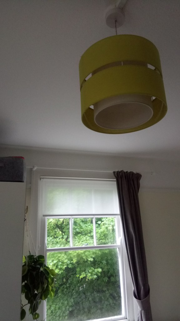
So I started off thinking about colour and it reminded me that perhaps the main reason why this colour doesn’t scare me is that I have a lot of accessories in my home of this hue. It’s called a few different things online, though I would say chartreuse or sulphur are the most popular. I’d say that over the last ten years or so, my favourite decorating colour has morphed from olive green, into chartreuse (a hint of green here) to sulphur (more yellow tones) and it’s heading towards mustard at the moment.
BELOW – L-R: Sulphur and grey cushion + mustard cushion +neon pothos on charcoal grey sofa / Anthropologie sulphur coaster on teak G-Plan dressing table + concrete planter / My sulphur lightshades that are in the bedroom and office / Sulphur cushion combined with London Underground cushion from original Tube seat designs (by Kirkby design)


HOW YOU STYLE NEON POTHOS
I asked on my Instagram stories for you to share your neon plant styling with me to share in this post – here they are below. Thanks for sharing!
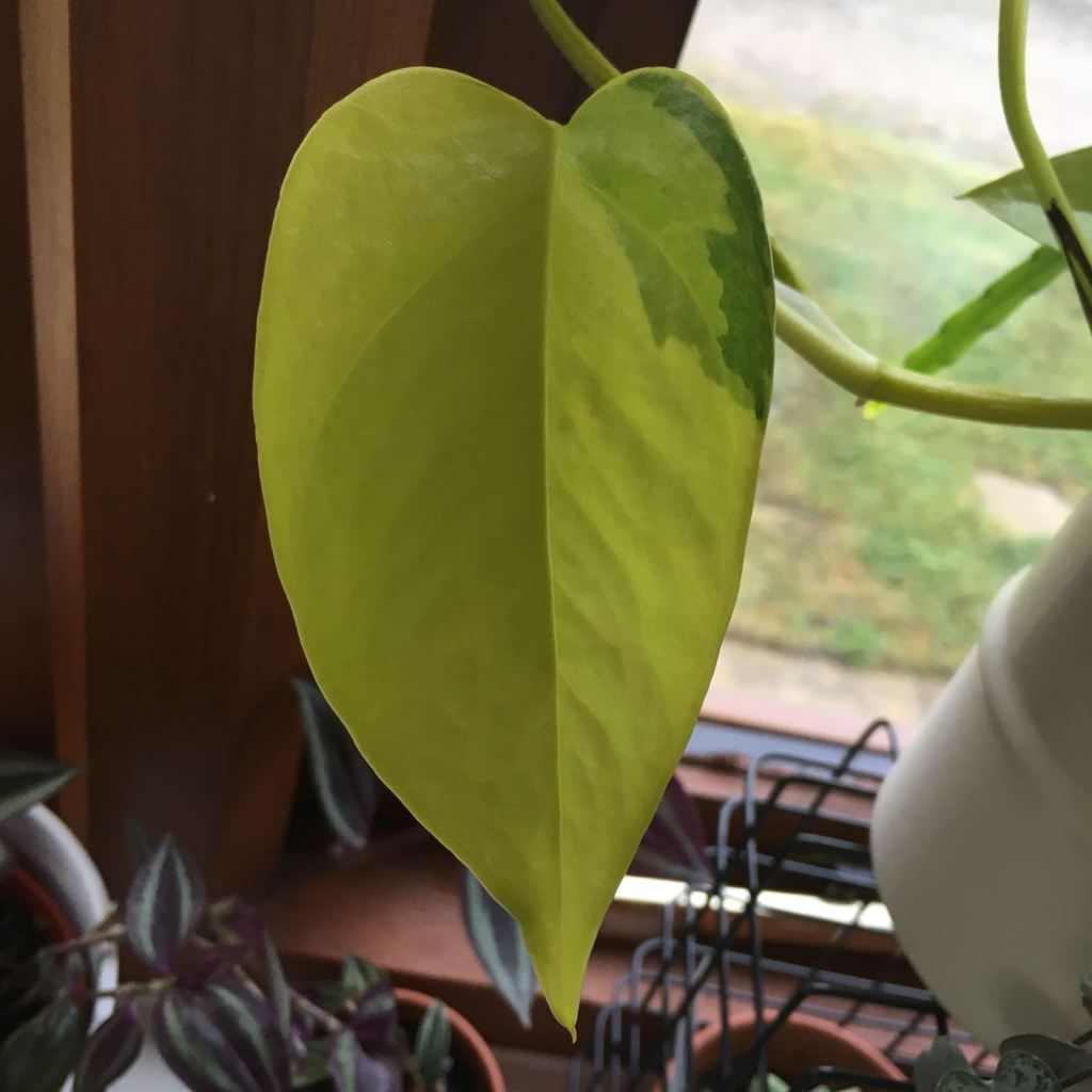
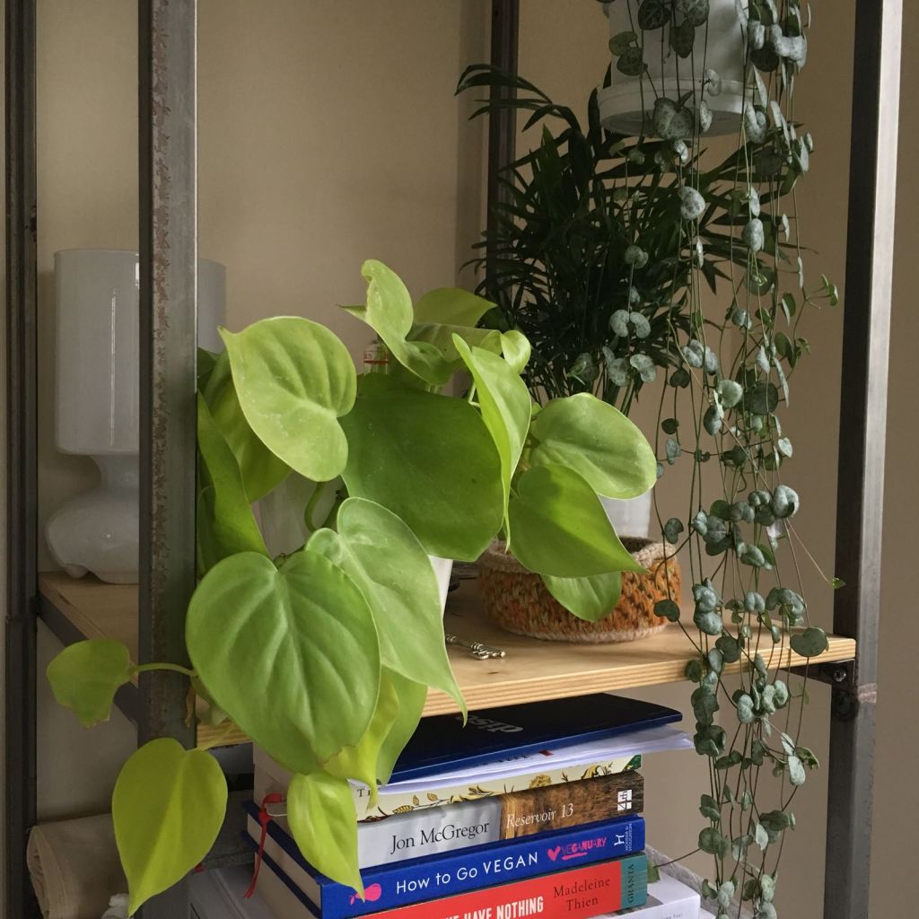
Photo credit above (both images): Brad @v60fan
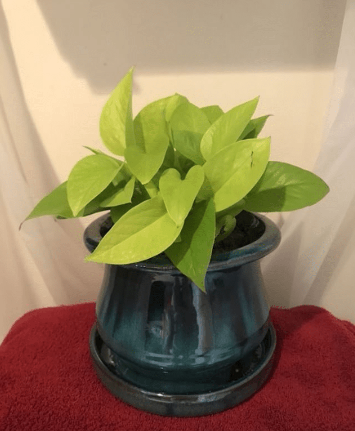


Photo credit above: @phytobabe / @mavi_figuera / @katiemajerus


Photo credit above: @katiemajerus / @theleaflet_


Photo credit above: Vic @flora_and_fauna_101
As you can hopefully see from the photos above, they way neon seems to work best is in a more minimal aesthetic in my opinion. Placed casually on a bookshelf as in Brad’s photo looks really effortless and adds a pop of colour. Brad is a friend of mine and has a great eye for design – he’s the king of the paired back cool aesthetic. Being such a high impact plant, it really stands out against white walls / or a monochrome setting. The wire house with the neon trailing down is a great example of this.
Another pairing I love is the colour of the neon against teak wood/terracotta – it’s quite a retro colour combination but can look fresh when things are kept minimal. Vic’s hanging neon was actually the photo that got me on the hunt for this plant a few months ago. She’s super stylish and has got a beautiful home and that colour co-ordinated bookshelf sets the neon off so well!
Now, I just wanted to point out here that I know the photo below right is not a neon pothos – it’s a gorgeous hosta belonging to my friend Joyce of @foliage_therapy on Instagram. But I just had to share it in this post as the colour is so similar is really helps to illustrate how great it looks against a dark background, or paired with dark foliage (I’m thinking the deep green of aspidistra leaves, or the foliage of a ZZ raven even.
Photo credit below: me @_houseplanthouse / @foliage_therapy
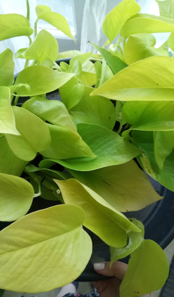

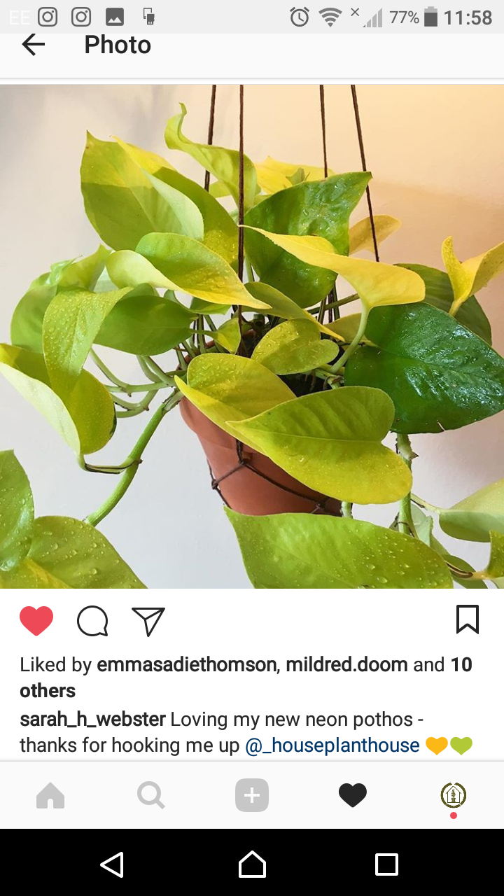
Photo credit above: @sarah_h_webster / I just had to include this beautiful photo as after posting my neon, Sarah got in touch and I sent her one.
If anyone is looking I can hook you up with some…
HPH NEON STYLING TIPS:
🌿 If you are hesitant, I’d say take the plunge and give neon a go!
🌿 Keep things minimal – colours I think work best are blocked out below to really help the neon make a statement. I would say neon works better with bolder or monochrome tones as opposed to soft colours.
🌿As you get used to the colour, keep neon on it’s own and maybe hang it in a corner of a room, or place on a bookcase. When you feel more confident, experiment with different plant pairings if you want to.
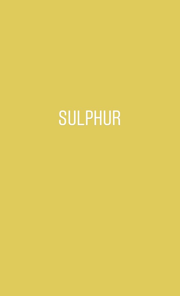

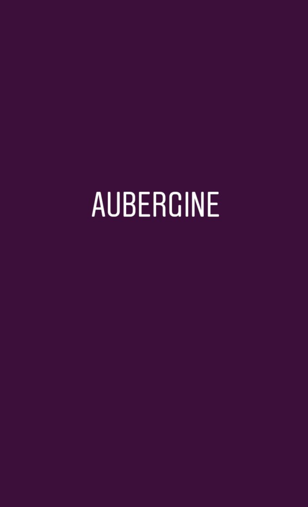


Photo credit below: me @_houseplanthouse
Hope you enjoyed reading this post, I’ve certainly loved putting it together.
If there are any other plants you would like help with styling in your homes send me a DM on Instagram and I’d be happy to help

Leave a Reply